17.11.11

Printing in the Third Dimension


This post isn't about impression, although most of you should be printing with a bit more impression than you are. If it was good enough for Harold McGrath (him up there)...


Before launching into the printing of Occupied By Colour, we finally got around to an upgrade of the speaker system in the studio. Retrieving one of the many old speakers from the attic, we ginned up this trick first learned from our vinyl copy of Eno's On Land, way back when it came out:


The two stereo speakers in the HM studio are over the bench, at the end opposite from the press. Printing a sheet entails two round trips from the press to the bench & back (getting the roller, returning with the roller & getting a sheet). We placed the third speaker over the press, playing the mixed signal back at the stereo pair. So now, while walking to and from the press, the aural mix of a song changes as you move through the space, and the overall sound is more three-dimensional (no more walking towards & away from the music).
Music is the fuel that keeps the press running at HM. This probably is true for most printers. (Or at least some distraction: for Jim Rimmer, it was VHS copies of movies from the '30s and '40s.) At HM, there actually are two categories of music, depending on what's happening. While setting things up, doing makeready, figuring out problems etc, we prefer glacial and expansive compositions. Stars of the Lid, most of Harold Budd's albums (check out his latest, above; an inspiration for those who strive to never repeat themselves), Johann Johannsson & William Basinksi are frequently called upon. When all cylinders are firing and we're just into production (remember, however, that "production" on a handpress in a one-man shop is still a pretty sedate activity), the BPM can creep up to a saunter, and the pace can liquify from permafrast to tundra. Harold's album with Eraldo Bernocchi, Music for "Fragments from the Inside" keeps things moving. So does the Orb. On particularly belligerent days, G!YBE.


There are a few artists whose work can fit both needs. All of Loscil's recordings. Bill Laswell, but you have to pick your albums carefully. And now we have a new double-CD for the shortlist: Bloemfontein's The Longer Now. This was a $1 gamble from a shop's discard bin, noted for its sleeve design, chosen because the mix of instruments promised to appeal (especially the lack of vocals). Wonderful stuff. Eight compositions, each about 15 minutes long. All of them can be heard here. Sadly, it seems the band ceased to exist with no other releases.

9.11.11

A New Magazine Called Codex

Moving at the speed of a handpress (which is this & only this:


Not this, [which is a common press, i.e. similar design & operation, but made from wood]:


Nor any of these, which are presses operated by hand, but that does not make them a handpress:


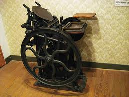
A handpress is something like this, made from iron, with whatever you're printing inked by hand and then rolled under a platen lowered by pulling a bar:


And preferably it's something exactly like the above, what we use at HM, an Ostrander-Seymour Extra-Heavy. But that photo isn't ours. It's much prettier than ours. Probably not a spot of oil or grease on the thing...)

ANYHOW, moving at the speed of a handpress, our friend David at Black Stone Press tipped us to the arrival on the scene of a new mag about type, printing, calligraphy etc etc titled Codex. At the risk of confirming exactly how hors courant we are by posting this a few months after its publication, here's the site. Take a look, think about ordering a copy. All of us who appreciate the printed word have to admire a group of people who go the old-fashioned, ink-on-paper route.

4.11.11

Ink Should Be Sticky, Not Bouncy


Surprised and a little alarmed to recently learn that a number of "fine press" (awful term) printers are using rubber-based inks. Some claim they achieve better results than with oil-based ink (hmmm), some admit they just like being able to leave the ink on the rollers for a few days.


Ink, as a contributing element to printing, probably doesn't get as much attention as it should. Wondering if our prejudice against rubber ink was warranted or not, we did some snooping around. Preliminary results tumbled us to Brian Donnell's excellent primer site on letterpress, which includes a short but insightful comment on oil vs rubber inks:

"Use oil-base inks for quality work. Rubber-base inks may print satisfactorily, but their drying properties make them suitable only for imprinting business forms, numbering, proofing, etc., and they do not dry on coated stock."

That's just an excerpt; the site offers more details. Coated stock isn't really a concern or issue at HM, but we wonder if the same drying problem would result on the highly sized paper we prefer for printing damp.


We'll be spending the rest of 2011 printing the third volume in the Hodgson/Cohen color series, Occupied By Colour. (The self-portrait above was taken while rolling out the ink for today's run, a page on the development of hair dyes.) But when we get a few days off, we're thinking of getting a can of rubber ink and doing some comparison printing. Be interesting to see how the rubber stuff works when printing damp... Meanwhile, we will reread Colin Bloy's A History of Printing Ink.

28.10.11

Lumiere's Shining New Light


Received notice of a new book from Michael Torosian's Lumiere Press, Steichen: Eduard et Voulangis. The book publishes for the first time 16 photographs taken by Edward Steichen between 1915 and 1923, with an accompanying text by Torosian. (Factoid: Steichen was the most-published photographer in Alfred Stieglitz's journal Camera Work, for which he also designed a logo and typeface.)


Over the past three decades Lumiere Press has established a reputation for publishing books with and about 20th century photographers, designed, printed letterpress and bound by Torosian at his Toronto shop. Although Lumiere Press doesn't seem to come up often within the narrow context of discussions about contemporary fine press activity in Canada (a short discussion at best), Torosian has been consistently publishing some of the country's most interesting and beautiful limited edition letterpress books. He's also one of very few people combining a passion for traditional book arts with a deep interest in photography, a field that has been at the center of contemporary art in exactly the way "fine press" publishing hasn't. The Lumiere Press site also has excellent images and information about its books and methods of work. Worth a look.

25.10.11

Making an Exhibition of Ourselves


Another post from last weekend's Wayzgoose printing fair, this one all about us (mostly). Jim Westergard and his wife flew in from Red Deer to accompany Oddballs' first (& only, at least by us) exhibition in Canada, and it was brilliant to have them on hand. As previously mentioned, we printed up 10 copies of a poster ganging all 40 (plus one) of the oddballs together, which Jim signed and numbered with assistance from the HM devil, before the doors opened. These are 22 x 30 inches (image area is about 12 x 21 inches), giclĂ©e printed on 180 g all-rag paper. A few copies of these remain, priced at $60. 


Barbara Hodgson was on hand to discuss The WunderCabinet, a display of which occupied most of HM's second table. As shown above, she didn't get a minute's rest all day, in large part due to an interview with her about the project which aired on CBC Radio's North By Northwest show that morning. As proven in previous years, a mention of the wayzgoose on Sheryl McKay's show assures a significant boost in attendance at the show, and this year was no different: many people came in specifically to see the book and meet Barbara, having heard the interview that morning. A podcast of can be found here.


Jim was diligent about pulling his weight as an exhibitor, but he did manage to make a few circuits of the room over the course of the day. Below he's talking to HM's secret weapon, Reg Lissel, who was demonstrating how to make paste papers. 


Jim brought along a number of the trade books that feature his artwork, and lucky people snapped these up (and got them signed). Jim's off to Toronto in late November for an event organized by Beasts of New York publisher The Porcupine's Quill. It will be an evening's discussion between/among Jim, author Jon Evans, and Toronto printmaker George Walker. 

23.10.11

Things We Saw

A few things we saw at the Wayzgoose printing fair in Vancouver....


Marlene Yuen's A Haunting History of Vancouver. A collection of short ghost stories that Marlene culled from and about neighborhoods in Vancouver (the book, published this year, also commemorates the city's 125th anniversary). The text and images were silkscreened, with additional glow-in-the-dark colors printed on the images. Marlene had a haunted house set up on her table, with a dormer window that let you peek in and see one of her pages glowing. Very cool. Accordion fold in printed boards, edition of just eight copies, a steal at $300. See more about the book and Marlene's other work here.


Peter Braune created an etching that he and Lesley Anderson editioned at their table (next to HM). Quite lovely. An addition to Peter's large collection of frog art. (We must ask him about the origins of his frog fascination.) Among the many imaginative cut-outs and pop-ups at Judy Ng's table, the HM devil (below, being shown by Peter how to ink the plate) found a card that opens to reveal a croaking frog, so she got it for Peter.


Emma Lehto's work stood out from the crowd (look under Typography, page 2). In concept and execution, it reminded us of the books Cara Barer creates for her photographs. While the Danielle Steel paperbacks that had been blasted with shotgun and rifle (the spent shells on display in a Lucite box) where dramatic (the paperbacks proved surprisingly resilient), her most sublime work on display with a completely deconstructed copy of a Lemony Snicket book: she cut out each individual work in the book (she must have used two copies, one for the recto words and one for the verso), and then assembled these on letter-sized sheets of paper in alphabetical order, i.e. all of the word "after" glued down in neat rows, then "and," then... Thus, the entire story was there to flip through.


Polly Elsted, daughter of Jan & Crispin (a.k.a. Barbarian Press) was there with a prospectus for a new book from her Horse Whisper Press, featuring wood engravings by former BP collaborator Peter Lazarov. Balancing production with her undergrad in English, she hopes to have the book completed in early 2012... Greenboathouse Press was there with copies of the latest books on hand, including poet Robert Kroetsch's last work... Reg Lissel was making paste papers, and a mess... Phyllis Greenwood was making marbled papers, and a bit of a mess but not as much as Reg... Finally met Marcus Fahrner. He had a small book on hand called Hell Box - The Book, which, if we got the story straight, is a sort-of reduced reprint version of an extensively illustrated text detailing the development of printing technologies. That's probably not quite right. It looked intriguing, but the Fahrner & Farhner Web site is somewhat inscrutable, so we'll have to track Marcus down again in person... The Bowler Press continues its descent into the depths of Jane Austen, a voyage that is heading toward a three-volume edition (with text set by hand) of Pride and Prejudice... Lucie Lambert has a new book, but every time we went by her table there were people clustered around, so we didn't get a chance to see it or talk to her... Andrea Taylor had just completed her second suite of prints in the Artists' Portrait series. HM assisted with production of the first suite, in 2009, but our schedules didn't match up for this one, so Andrea set and printed the text pages herself. More beautiful intaglio portraits of (mostly) 20th century artists. Lucien, shown below, is from the first series.


There was more to see, but attending to our own tables prevented us from getting around to everyone. Perhaps in future years we can think of a way to introduce a social aspect to the event, to allow us to mix and mingle more. For whatever reason, Vancouver seems to have book arts silos, as opposed to a book arts community.

19.10.11

Get Your 'Goose


The bi-annual Alcuin Society Wayzgoose in Vancouver this coming weekend. Seems to be some attrition among the local printing scene, never a good thing but most particularly unfortunate here that it's among the younger (i.e. under 40) members. But HM will be there: Barbara Hodgson will be laying out a mini-exhibit with a copy of The WunderCabinet on one table, and Jim Westergard will be traveling in from Red Deer to show off Oddballs. Our Oddballs poster (10 copies, signed & numbered by Jim) will be on display & available. The New Leaf Editions crew will be there, pulling copies of an original etching created for the fair, and showing copies of a new book created by artist Kitty Blandy. Reg Lissel will be there, showing people simple ways to create paste papers. Saturday 22 October, main branch of the public library, 10 a.m. - 4 p.m.. Free admission to all.