18.11.13
Monday Mash
Odds & ends to start the week. That's another shot of Claudia Cohen's binding for the deluxe issue of Paper Should Not Always Be White above. One aspect of the binding she was particularly pleased with was using very thin boards (without any warping), making the small 8vo-sized book feel light & comfortable in the hands. Below are the three tooling variations used.
One of our stringers sent this link for a film by David Lynch, a short documentary about a proper lithography studio in Paris.
Speaking of Lynch, we got a copy of his album Good Day Today in the "limited edition" version designed by Vaughan Oliver. Here's an interview with Oliver about working on the project.
Speaking of Oliver, Facing The Other Way, the 4AD history we mentioned last summer, has been released. The 1,000-copy deluxe version - issued in two volumes, which seems a good idea since it apparently is over 800 pages - is supposed to be shipping by the end of this month. So we'll hopefully have our copy under the tree for Xmas. The second consecutive Oliver-related Xmas!
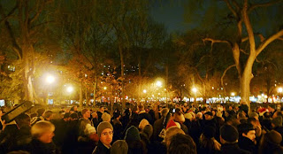
Speaking of Xmas and 4AD, put this joyous sound in your ears, and then this, when you can no longer stand the few dozen marketing-approved tunes we'll suffer through ad nauseum during the next six weeks. And then get this free app, organize a few neighbors on a snowy evening, and do something that's as close to spiritual as a secular humanist can get. Then go home & watch Eraserhead on Xmas Eve.
14.11.13
The Finest Traditions in Hand-Set Type
How's that for a mouthful of busted chiclets? Oddly, it takes more time to set & lock-up a disaster like this than setting it properly. Part of the genius of movable type: it resists being used improperly. But we showed this Garamont who's boss.
All in aid of the new book, which has (yet another) new tentative title: Improvised Impressions. The title reflects the process that came to be used for displaying each face in the book: While there was some general design conceived in advance for each page, the details were worked out on the bed of the press, as the type was set. Where books typically are exhaustively planned in advance, the complete lack of continuity in content or form from page to page in this collection of types allowed (& often required, due to a shortage or complete absence of one letter or another) an improvisational approach. Intuition was the guiding principle. Each page was created in the moment, each step and decision a response to the one preceding it, working within the constraints of the page and what was available in (& lacking from) any given drawer of type. The entire undertaking is underscored by an impish attitude toward the types on display: respect, but not reverence. Improvising is an act of the moment; the printed pages in this book are permanent records of the improvisations.
Down to the last few sheets now: the foreword, title page & colophon. The edition will be 35 copies, with the first 15 being a deluxe issue. These will be bound in full vellum by Claudia Cohen, and contain two additional sections (16 pp.), per the last post here. As the image above suggests, the second of those sections gets a bit unruly.
Speaking of Claudia, did you know there actually are three variations to the deluxe binding for Paper Should Not Always Be White? She came up with three designs for tooling the front board & we couldn't pick a favorite, so she did all three. Two of them are shown above. There's no priority or preference (except one's own). We'll post some more images of the deluxe binding next week.
11.11.13
Weirder & weirder
This are getting strange around here. Above is a page from the second of two extra sections that will be included in the deluxe copies of the new book. This section features display sizes of eight faces already shown in the book. The paper for this sheet is Roma.
New working title for the book: Improvised Impressions. Explanation to be included in the foreword.
Details for both states of the book have been hammered out; we'll post them on Thursday. Gotta get back at it now.
7.11.13
She's A Rainbow
Tried something for the first time this week. Turned out really well. Printing with a rainbow roller. Also known as a split [ink] well. It was for the Gallia display page in the new book. The type's name was set in 36-pt in the middle. Above & below, the alphabet (no lowercase for Gallia) & numbers, with leading decreasing as you approached the top & bottom.
Three colors: black for the Gallia (i.e. in the middle), gold for the upper portion, red for the lower. Measured the height of the form, in inches. Laid down a piece of masking tape on the glass slab & marked borders between the colors. Laid down a second piece of tape, perpendicular, along the left side, as a guide to keep the roller in the same place when charging it. Rolled out the inks.
Naturally the inks would blend where they met. Trick was not letting the black overwhelm the other two, especially the red. Adjusted each of the colors as we went, in exactly the spot (i.e. line) on the roller that needed a boost.
Another thing that might be easier to do with a handpress, or at least hand inking, than with a mechanized press. Need to do more. Rainbows everywhere!
4.11.13
Kay, Abe & El
The deluxe copies of the new book will include an additional section showing four uncommon, foundry titling-sized faces on loan to HM from friends: Anker Romanisch, Coralus, Gallia and Kabel. Above is the 72-pt Kabel. Isn't it clever?
More details about the deluxe issue soon. Pretty much settled on an edition of 35 copies total, with the first 15 being deluxe. These will be bound in full vellum by Claudia Cohen. Copies 16 - 35 will be cased at HM in marbled paper over boards, similar in style to Types/Paper/Print. Been pushing to get copies out before the end of the year, but decided to slow down about, enjoy the work, and issue the book in January 2014. More as it happens...
31.10.13
What a Typographic Book Should Be
Let's take a much-needed break from blather about HM, to look at a truly inspiring book: A Glossary of Typographical Terms, with text by Oliver Simon, published by the Blackmore Press of art school student Bev Leech, Vancouver, 1961 (oblong 8vo, [90] pp.). A limited edition of 56 numbered copies, set in Garamond and printed on Golden Hind laid paper (same as our Kuthan goof from a few weeks back).
A tour-de-force of letterpress design, creativity and printing. This was Bev Leech’s graduation project from the Vancouver School of Art, where Bob Reid was one of his instructors. As Bob recounts, no one knew what Bev was up to that whole semester, until he presented this book, completed, to tremendous applause.
Per the title, the book is an illustrated glossary, starting with Ampersand and concluding with Wrong Fount. Each recto presents between three and six brief definitions, with one of them being illustrated on the facing verso. The term being illustrated on each spread is printed in black; the other terms are printed in gold. The bold illustrations were created using a variety of techniques, including linocuts, metal plates, metal types, wood types, tipped-in samples (i.e. deckle edge, hand-made paper, marbled paper), flowers, and rules, all printed in a variety of colors.
Not only is the book artistically conceived and beautifully printed, but Bev had the sensitivity to have it bound by a professional. The endsheets are made, not tipped on, and the back has been rounded. Oblong books really aren't our scene - ever & emphatically - but this one works.
A very cool book, all the more so for being essentially unobtainable now. (Three copies are known to have been available in the past 15 years: one is HM's, one is ex-library & was picked up for a song by a printing friend, and one passed through our hands, on the way to a Special Collections. If one is offered to you, don't dicker over price, just buy.)
Bev Leech went on to have a long career as a graphic designer. In the later 1960s he followed Bob Reid and Ib Kristensen to Montreal, and then returned to B.C. (with a bunch of the wood type, Caslon in all sizes from 8-pt up to 72, and thousands of sheets of Guarro paper, which ended up at HM a few years ago and upon which we have since printed a number of books, including the recent Types/Paper/Print). In Victoria he worked as an in-house designer with the famed Morriss Printing, but the glossary was the one and only publication of the Blackmore Press: he did no subsequent “fine press” work. With pleasing symmetry, he designed a new, limited-edition of Roderick Haig-Brown's Pool & Rapid (scroll down a bit & you'll see copies of the book still available at issue price, $100), published by the Haig-Brown Fly Fishing Association in 1996 (remember our previous post about kool H-B books?). It was the last book printed at Morriss Printing. Bev is now retired, much of his type and his printing equipment is in the hands of Strathcona Press, an hour up-island, in Cedar. We met him a few years ago at an event celebrating the career of Bob Reid, and he graciously signed our copy of A Glossary of Typographical Terms.
28.10.13
Rollins' Wisdom
Passed the half-way point for printing the new book this weekend. Above is the first side of the Wookey Hole sheet: a quote from Carl Rollins set in ATF's Verona. Three runs in one day (150 impressions); that's about the max we can do here. Tried something new: setting text in an oval.
Started by setting the rotating text straight on pieces of 25 pica lead, 14-pt Verona word spaced 4/M. Measured the length of the combined lines, in inches: 13.675 inches. That would be the oval's circumference. Using that measure, the 14-pt metal Verona is equivalent to 11.6-pt in the digital version. Used InDesign to establish the height and width of the oval required to fit the interior text (set in 24-pt Verona) was calculated.
One of the many kool things about a handpress is you can play with layouts and setting on the bed, since it's flat. Used two pieces of 1-pica wood furniture, held in place with magnets, to fix the circumference. Took two strips of 1-pt leads, and measured them to one-half the inside circumference (meeting at the horizontal mid-point).
Took two more pieces of 1-pt leads and measured them to the outer circumference. Started wedging things into place with furniture and spacing material. With the oval roughed out, the set type was dropped into place & adjusted. Printed it in gold on the dampened Wookey Hole. Easy enough once everything was in place.
Couldn't really pull proofs with the interior text in place, so instead we cut out a paper maquette with the width of each line and overall height, and placed it in the oval to check for positioning. Had to reduce the planned leading from six points to two. Printed the black lines.
That done, swapped lines out for the third run, in silver. Finis for the day. Eh; been wanting to try setting "in the round" for some time. Not sure it's really worth the effort. Took half a day to get the oval figured out. Done it, don't need to do it again. Just like what this sheet was backed-up with: the Three Uglies. Perfect counterpoint to the Five Beauties. We really are pulling out all the metal types hidden in drawers around here, and some will never be printed at - or even seen around - HM again; this book will be their debut & farewell.
Subscribe to:
Posts (Atom)


