24.10.13

The Shadow's Shadow is the Light


Before (right) & after (left) shot of the last run (silver) on the Van Gelder laid sheet: Gill Shadow in 36 and 24 pt. The title for today's post is a quote from a radio interview Tom Waits did earlier this year; it's set in 14-pt American Shadow on the facing verso (cropped out of today's photo). The other side of the sheet features Oldrich Menhart's Unciala in four sizes.

Been talking with Claudia about the deluxe copies. A plan is taking shape. More to follow soon. The edition looks like it will come in around 35 copies, with between 10 and 15 being extra-bound by her, with an additional section of samples. The remaining copies will be cased in marbled paper over thin boards - just like Types/Paper/Print - at HM. Both states will be issued before the end of the year.

21.10.13

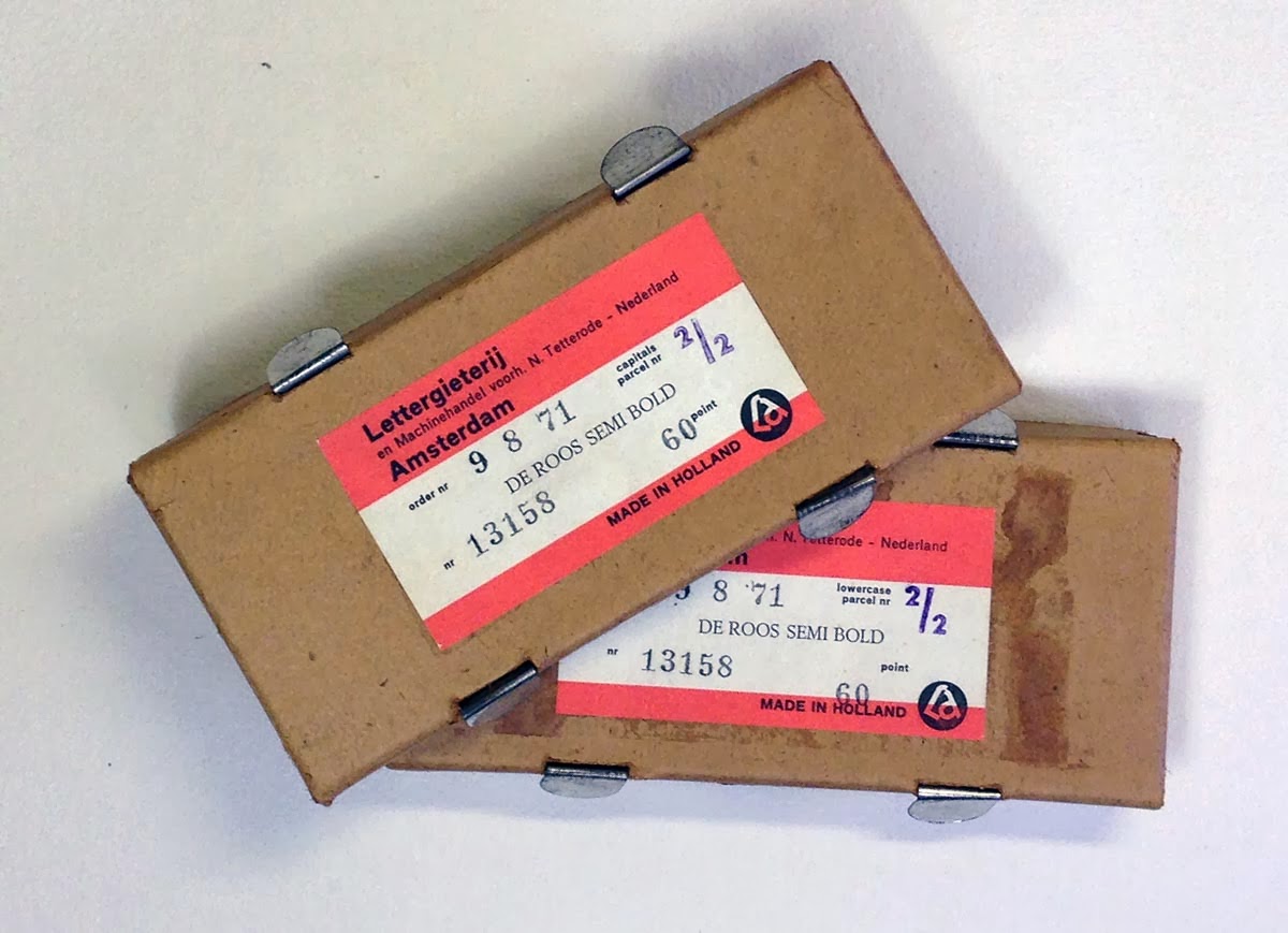
There's No Q, X or Z in De Roos


Here's the De Roos spread: 36-pt italic and 60-pt semi-bold. Bodleian handmade verso (back of last week's Five Beauties), Arches Velin recto. The fonts came pristine, in their original Lettergieterij Amsterdam packaging (a couple shown below). Inexplicably, the semi-bold is missing the Q, X and Z (but not the W, T, F and ?, which enables us to ask the question), so we improvised with the sorts we did have.


In the press this week: Morris roman and Reiner Script. Still pondering the book's title; suggestions will be considered.

17.10.13

The Five Beauties


Yesterday's run for Metal Types & Some Paper: The Five Beauties, a single font of each, not enough to anything useful. Collectively named in opposition to the Three Uglies, which will appear at the back of the book. The paper is Barcham Green Bodleian, a mixture of cold-pressed mould-made (a yellow tint) and NOT handmade (more off-white). Two color runs a day on a handpress is sufficient work-out that we get a bye from the gym.  

14.10.13

The Greatest of All Time


Printing; no time for blogging. Couple of pix: the back-up for last week's Kuthan sheet. Playing with 72-pt Garamond. The spread shows the basic format for the book: versos will list the type and paper of the facing recto, and attribute the quote if one is used.


The Garamond used a Muhammad Ali quote we've been wanting to print for years. The Garamont was thrown in just because we have it.

In the press today: some very old & worn Rubens, in several sizes.

10.10.13

Back in the Press, 50 Years Later


A shot of the first sheet through the press for Metal Types & Some Paper. Not really indicative of what the rest of the book will look like, because this one is building on a sheet that was originally printed over 50 years ago. It's one of the pages from Kuthan's Menagerie, published by Robert Reid in 1960. When the unbound copies that ended up being issued at Kuthan's Menagerie Completed came to us, there was a complete extra run of this page from the introduction. No idea why. We decided to recycle them for the Perpetua display page on the specimen book. It's slightly smaller than the book's 7 x 10 inch format, but a few of the other sheets are slightly smaller as well. Most of the other display pages in the book will be less text heavy & more shaped or patterned in the setting. Off & running.


7.10.13

Paper for Metal


Start printing the metal type specimen book today. Spent the past few weeks consolidating all the different ideas & approaches we'd developed over the past year, finalizing which types are featured & which play supporting roles, and deciding on a sequence for the book. Part of the sequencing decisions depended on trying to match faces with the various papers that will be used in the book, i.e. bigger and stronger faces with the heavier and more opaque papers.

The final line-up of papers that will be used is: Wookey Hole, Barcham Green Tovil & Bodleian, Golden Hind, kitakata, Reg Lissel's HM Text, Arches Wove, Van Gelder laid, Guarro laid (white and yellow), and Roma.

The edition will be somewhere between 30 and 40 copies, with about 10 including an extra section with four uncommon types on loan from friends, printed on an off-white Barcham Green sheet. More about this section later. 


Haven't finalized a title for the book yet, but for now it's being called Metal Types & Some Paper. Gotta get it published before the end of the year; things are happening around here...

3.10.13

Eyeballs This Way


As previously posted, we sometimes find books that simply cannot be left where they are, (usually in or near discard pile). The potential to use blank sections (margins) of sheets from broken books, especially ones printed on paper made before 1800, is becoming a particular interest at HM. Not really altered books, but new ones designed so that the type can occupy the blank parts of an already printed sheet. So whenever we encounter a broken book with lovely paper, especially if it's 4to or larger in size, with "generous margins," we take it home.


Looking through the collection of orphans & amputees recently, we re-encountered a German book printed in a fraktur type (with some latin phrases in roman) in Vienna in 1813, on paper that feels supple enough to sleep on. It came from a mouldy box of discards. Besides the paper, what really caught our attention was the section of hand-colored plates at the back (it had come loose in the box, and we were lucky to find it). The engravings were signed in the plate, but also appeared to be initialed by the artist.

Reading fraktur is hard enough even when you know the language, so it wasn't until the book re-emerged this week that we bothered to find out what it is:

Lehre von den Augenkrankheiten, als Leitfaden zu seinen öffentlichen Vorlesungen entworfen, by Dr. Georg Beer. The title roughly translates as "Study of the Diseases of the eye, as a Guide to His Public Lectures." 


The book isn't rare - there are numerous copies currently on offer - but it does seem to have some significance in the history of medical publishing, not least because of the colored plates. Bookseller Jeff Weber currently has a set (there are two volumes) listed; his description includes the following details:

"Beer is remembered for his textbook; the doctrines in it dominated practice for many years. He described the symptoms of glaucoma and noted the luminosity of the fundus in aniridia. He also presented for the first time the general principles of treating post-traumatic inflammations, including penetrating and perforating injuries as well as injuries to the orbit. He describes the first use of the loupe for the examination of the living eye. The plates in this work were both hand-coloured and signed by Beer. He was a distinguished iridectomist. Many of his pupils became famous ophthalmic surgeons. Beer opened the first known eye hospital, in 1786, in Vienna. He was the first Jew to graduate in Austria. English translation, Glasgow, 1821." Garrison and Morton.


Georg Joseph Beer is considered the founder of the Vienna school and was "an excellent surgeon and a capable artist who illustrated his own books. He was one of the best known teachers of ophthalmology of all times and trained a generation of ophthalmologists who carried his teachings to their own lands. Beer was the first to use a loupe for external examination of the eye." Gorin, History of Ophthalmology.

According to another source, Beer "personally coloured the figures of abnormal eye conditions to ensure their accuracy." Weber's set is dated 1817, but it sounds like a the same edition. It probably just is a later issue, which makes sense if you consider how long it would have taken Beer to complete all the coloring for each copy.


Perhaps the most endearing aspect of this copy is the binding: it is sewn (all 600 pages) and simply covered in a beautiful Holland blue paper over very thin boards, with no printing or writing of any kind on the exterior. It's probably worth sending to Natasha Herman to be restored, even though the single volume probably couldn't justify the cost. A beautiful reminder of when publishing actually involved people working directly on each copy produced.